Woodin + Associates is a land developing and engineering firm in Middletown, Delaware whose main business is land surveying. In 2011, we revised their brand identity including their logo, signage, vehicle graphics, and redesigned their website.
Goals:
– Modernize the existing logo, making it look cleaner and more modern.
– Keep the general shape and aesthetic of the existing logo.
– Communicate the vernacular of the Construction industry, with the audience being industry professionals.
– New logo and colors must be able to be used alongside the existing logo and colors, during a transition between logos.
– Website contains various pages and projects sections.
The logo was redesigned from their original mark, which appeared dated and was geometrically uncomfortable. Using one of their tools of the trade: a land-surveying device, called a Philadelphia Rod Target Vernier device, I drew inspiration and developed several logo concepts that merged their existing logo with the aesthetic of the device. The “+” from their name was strategically placed to represent the crosshairs of this device. Because it was placed directly in the center of the oval, it creates a geometrically sound shape that is solid and stable. The old logo has the “+” to the right due to the sizes of the type, and makes it appear unstable and wonky. The new typography uses a very modern, futuristic looking face that has letters consistent in size. This allowed me to place the “+” in the center, which resulted in a balanced geometric logo.
Pearce & Moretto is a civil engineering company located in Middletown, Delaware. They hired me to revise their logo without changing what it actually was. While open to ideas for ways of modernizing the mark, they wanted to keep the typographic bulldozer they had been using for years. This original logo was well established in their industry, and was used on signage, vehicles, and marketing materials. The goal of the new logo was to be cleaner, more modern, and look a bit more aggressive to properly fit within their industry. While undergoing this rebranding effort, the client was only interested in changing one thing at a time and did not wanting sweeping changes across everything. Therefore, this new logo needed to work alongside their existing logo – as that would still be used on their vehicles. The vehicle graphics used a different color red, from the original style guide logo, which had been defined by the color vinyl that they had previously chosen. It was decided prior to my involvement, that this was the color they wanted to be used consistently across everything.
Goals:
– Modernize the existing logo, making it look more aggressive, and cleaner.
– Existing concept of a typographic bulldozer must be maintained.
– New logo must be able to be used alongside the old logo, during a lengthy transition between logos.
– Vinyl color red from the vehicle graphics to be used as the consistent color for the identity.
– Create multiple size logos to be used on business cards to large signage.
– Create a style guide with vehicle signage guides for future vehicles.
The process for this project started by redrawing the old logo from scratch in Adobe Illustrator, since the client did not have a vector logo file. The tread shape shape that houses the tagline was refined to a perfect pill shape, and the tread marks were distributed evenly. The shape of the scoop was drawn to match up with the tread, and the lines were emboldened to add weight. The most dramatic change was the typography, and because this mark is a mostly typographic solution, it was the most important part. We mocked up dozens of fonts, and eventually settled on an italic square font that is very masculine and fits within the construction industry. I set the typography tightly, and combined the t’s. I set the top line on the angle of the italic, so that the alignment of the two lines form a forward moving dozer. Finally, contrasting the “Inc.” mark and tagline in all caps, and setting in grayscale gave the mark hierarchy and depth.
After successfully designing the new logomark, I needed to define the color to be used on all materials. Because we had the starting point of the vinyl red, I obtained a sample and worked backwards from vinyl to RGB, and CMYK. In addition, they required a tiny black logo to be used on ultra tiny materials. For this mini version, I stripped away the tagline and emboldened the tread to compensate for the visual weight. A styles guide was also designed, and contains a breakdown of all versions, files and additional rules for vehicle graphics.
The Legal Workplace brand was developed for a legal based workplace study, targeting legal administrators as its’ main target audience. The brand name communicates who this is for, and the tagline describes what it is. The logo icon and logo type present clean, professional graphics that tie together a legal column and bar chart.
Ultrachem Inc. became a client in 2012, when they hired me to build their next website. They are an international manufacturer and distributor of synthetic oil products. The website project required it be built with a full back-end that would be used by their in-house design team.
Requirements:
– Build a database of all products with separate fields for: ISO Grade, Viscosity, Index, Flash Point, Pour Point, and Specific Gravity.
– Organize and connect PDF sell-sheets to each product.
– Dynamically display all information and PDFs on their respective pages, organized by category.
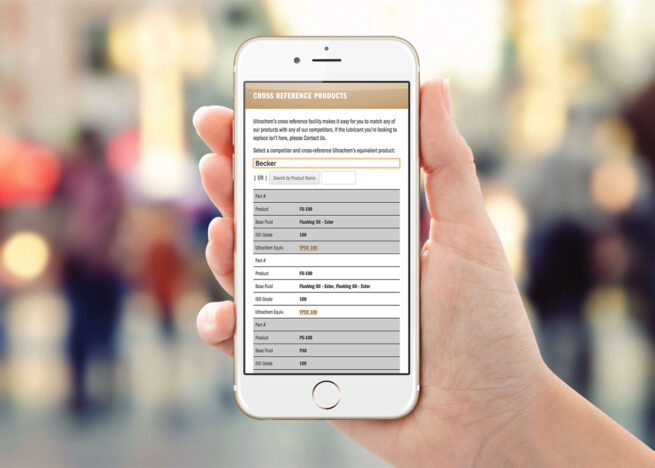
– Each product has cross-referenced products from major oil manufacturers for which they could be substituted.
– Cross reference page needs to search and dynamically cross-reference substitutes, and display in tabular data.
– Include call-to-actions to directly connect users to their contact information, newsletter signups, and request forms.
I used WordPress as a CMS, as it met all of the requirements. Using Custom Post Types, Taxonomies and Categories, I was able to propagate all of the correct content to the respective areas, while maintaining one easy-to-use database.
This site was the largest back-end development undertaking I’ve done, and it was challenging to organize all of their products because of the numerous data points required by every product. Although WordPress was fully capable of meeting my needs, it was difficult to categorize every product, and propagate it’s information to the right place. Furthermore, the task of entering this data was massive. The cross reference form used AJAX technology, to search and load all of the content without reloading the page.
The Cross Reference Page was a major challenge, and was the most important as it was the most used page. As Ultrachem makes and sells oil substitutes, users need to be able to put in the product for which they require a substitute. This can be searched by brand name, base fluid, and ISO grade. Upon finding the equivalent Ultrachem oil, a user is given a link directly to that product where they can learn about it, and access PDF sell-sheets.
I learned that this was the most popular page, and was primarily accessed by users in-the-field on mobile devices and tablets. This information was key to understanding how this page was used, and allowed me to design the right interface. The problem was the tabular data that was difficult to use on a small screen. On a large screen, it was no problem, because the long table was fully visible. But on a mobile phone, the table was scrunched together, and scrolling across was confusing and difficult to see data across the whole table. I solved the problem with a unique design and development solution, using different CSS rules to display the tables differently on different devices. On a computer, it would display normally, but on a tablet or phone, the table rows would be blocked together and display vertically. All of the necessary information is displayed together. Although it looked a little different than the normal table, it was easily understood after I applied solid background colors to each table row.
It was very rewarding to build a much more complex site, within the framework with which I was comfortable. Successfully solving the most important project problem —displaying the tables on a phone — with a simple and elegant design and front-end development solution was the best part of this project because it met the clients’ need and was fulfilled quickly and easily. I just had to think about the problem and understand that the solution was within the problem itself. Small screens displayed the tables differently, which was the issue. So, I had to make small screens display the tables differently — but control how they displayed, and reorganize the visual information a little differently.
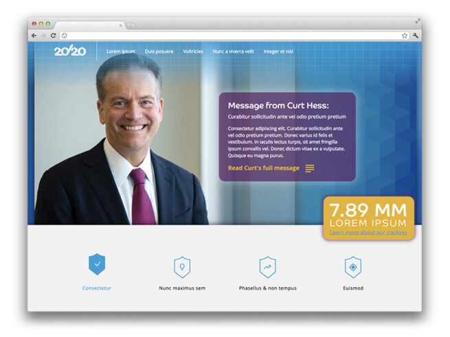
The 20/20 initiative was launched in 2015, during my time as a Designer at Barclaycard. It was created to establish and outline the organizations’ goals and objectives through a five-year plan, ending in 2020. This website was a means to remain accountable to these goals, and track their progress on a monthly basis. A newsletter was distributed each month, with a link to an update on this micro-site.
It detailed dozens of initiatives, corresponding representatives, priority levels, financial data-tracking graphs, a timeline, plus additional information. Leadership would provide my team with PowerPoint slides with data-rich content to be distilled into a clear communicative hierarchy, corresponding iconography, representative data-visuals, with-in an overall slick, modern interface.
Due to confidentiality issues, I have swapped out the text content with Lorem Ipsum.
My role and contributions
I was working a hybrid role as a Graphic Designer / Production Artist for the Creative Marketing team at Barclaycard, when this project came to fruition. Because of my interest in UX Design, and my Front-end Development skills, my Creative Director made me lead on this project. I worked with several teams to successfully complete the project — Creative, UX, and Leadership. We met with Leadership to discuss high level goals, content, and progress. My CD managed the project, and helped to decipher the bloated PowerPoint slides we were given. Upon simplifying this information, we broke it down into a clear hierarchy and I created a clean, sophisticated design.
With the help of the Technology UX Design team, I was given a development environment to create the micro-site. The most challenging part of this project was the browser we were targeting: IE7. Ugh…
The audience for this site was every employee in the organization, and the most common denominator in terms of browser was, unfortunately, this one.
Using Bootstrap, XHTML, CSS, and jQuery I developed a simple micro-site that was functional in even the worst of browsers. This micro-site was hard-coded, not setup to any CMS, and I manually changed the content from month-to-month.
Design breakdown
The first section features a hero banner that displays an image of the executive of the month, who was providing that message. There would be a long letter from this executive, which displayed a snippet in a box, and could be clicked through to open the entire message. A ticker slides in on the right, in a bright yellow box, displaying the total amount of consumer accounts.
The second section lists the top level buckets, of which all the goals were distilled. Upon clicking one of these, a menu is shown, with a further breakdown of the initiative. For each menu item, a slider is used to rotate through information pertaining to that objective. A breadcrumb navigational element is shown to provide the user with a tool-tip for what to expect next. Tags and icons were created to display what category the initiative belongs to. The representatives for each objective are displayed with avatar headshots, and a clickable email link. Finally, priority levels were assigned to each initiative, with corresponding icons and graphics.
The third section features eye-catching graphics of a countdown timer, and graph showing number of consumer accounts per month, displayed against the target trajectory of the next five years.
The fourth and final section features an accordion, that displays further information about these initiatives, nested into a clear hierarchy. Much of this information — when first provided to our design team — was impossible to understand, as it was all visible at once. But, when applying a hierarchy and different graphic treatments to typography, it became much easier to digest and understand. While I get it is difficult to see the exact nature of the communication — due to the Lorem Ipsum — I think the overall concept can be understood.
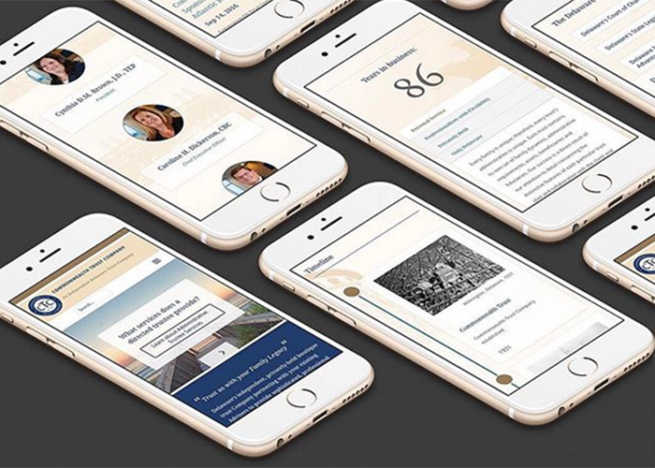
Commonwealth Trust is an independent privately-held boutique trust company in Wilmington, Delaware. It was completed during my employment at Möbius New Media. I designed, developed, managed and presented this project to the client. The goal was to create a small WordPress website with a custom interface that matched their brand standards. The resulting interface is a custom WordPress theme, designed and developed simultaneously in HTML, CSS and JS. SVG graphics were custom designed, and jQuery was written to create transitions, animations, and interactivity. I was required to use their color palette and logo, but all other elements were open. Their previous website was used as a starting template, and we re-designed the experience by separating all of the textual information into a hierarchy, and organizing into easily understandable tabs, paragraphs, sections, boxes, and quotes.
In addition to my contribution, Matt Urban of Möbius did a photoshoot of iconic Wilmington art and architecture, of which we used across the site. Back-end work was also involved, including hosting consultation, setup and maintenance. Google Analytics, tracking tools and an SEO campaign were created.
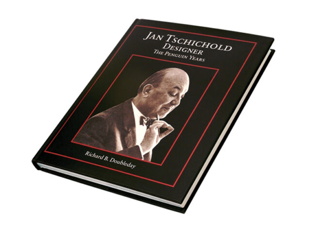
During my time at Oak Knoll Books, I had the opportunity to work on many fine-press, artistic books, but none were more rewarding than the complete book design and typesetting for Jan Tschichold, Designer, The Penguin Years. This project was offered to me by the author, as a freelance project outside of my daily role at Oak Knoll.
This project was a daunting task, because Tschichold was a master typographer and laid the groundwork for typographic conventions. He was very interesting because his early years, he was an advocate for centered, serif typography. But, in later years, he changed and laid the groundwork for Swiss design conventions: namely left aligned type and sans-serif typography. He had made a complete 180 in his design style, and that which he advocated.
Because I would be typesetting an entire book for this master, I knew I had to pay tribute to his conventions. Due to the content of this book being his years at Penguin books, when he was in his early years, I decided to defer to his style from this period. The typeface I chose, Sabon — an elegant serif — was designed by Tschichold. Most of the formatting and typographical conventions used in this work are those recommended by this master.
The book is over 200 pages of dense type, elegantly set with generous margins, with a more considerable margin on the bottom, and outside. And margins of lesser weight for the top, and gutter. This allows for optimal visual balance. There are over 100 full-color graphics of Tschicholds’ book covers, with proper captions, and footnotes. The book type uses a hierarchy of type, utilizing small-cap titles, italics, and rules. The dense type was set with fairly tight kerning, and fairly open leading — with greater leading between paragraphs and sections. The entire text is fully justified, with careful attention paid to widows, hyphens, and gaps/rivers through the page. The pages were set to achieve an optimal, consistent texture across the page.
The typesetting of this book was capped off with an elegant title page, and book jacket design. The elegant design was a success, and had been the most in-depth typography project I have ever undertaken. While designing this book, I had become an eternal student of typography, and used this opportunity to hone my craft. It was a lengthy project with a massive Adobe InDesign file — and meaningful to the very end.
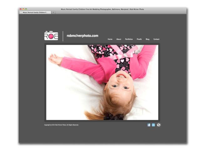
Perhaps my favorite project I have ever worked on was this one: for Rob McIver, a very creative photographer that specialized in music and band photography. Rob is a full-time photographer, and also a professional vocalist for The US Army choir. In addition, he became the band photographer for the US Army band. He also photographed lots of children, and personal photographs for couples; anniversaries, etc. His unique blend of talents and perspective, attribute to his style as an artist.
We designed his logo and identity at the same time of this website, and the most important goal was to be minimal, and let the photographs speak for themselves. I tried to speak his unique, often fun and silly, vernacular with a typographic play on his name: “ROB” across the front of a camera — the “R” and flipped “B” mimic the shape of human fingers gripped the camera from behind, and the “O” forms the shape of the camera lens. This play on type and human characteristics made it instantly communicable that: 1. he was a photographer, 2. he was fun, 3. his name was Rob.
The logo was designed a gray color, or white against a dark background — but the “O,” which represents the camera lens, where the magic happens, is the center of the logomark, and also the center of his literal name. Because there were many levels of metaphor here, and we really wanted to push the boundary of uniqueness, I programmed the logo in Adobe Flash to display a focal point (and color) of whatever photograph the logo was accompanied by. If the photo had a pink detail, then that pink detail was shown in the center of the logo. If the photo was orange, the logo was orange. This was a very fun way to visually represent: the magic from the photograph, displayed through the camera lens, displayed through the logo, displayed through Rob’s name. Our initial goal of letting the photographs speak for themselves was also maintained with this convention because there was never more than one competing photograph. The photo seen through the logo was a highlight of that photo, and therefore it highlighted it, and did not compete.
Of course, this was only able to be represented in certain circumstances, where Adobe Flash could be used. And, as of this writing in 2021, Flash is no longer available. So, the rules for the logo color still apply, and are mainly used in print media. When displayed in static web form, a standard color was chosen: pink or orange.
In addition to the brand identity, we built a custom Flash website using SlideShowPro — a back-end slideshow software that was a management system for slideshows. The main site was Flash based, and for his blog I designed and developed an accompanying HTML WordPress website that matched the style of the main site. This job also included various business cards with several photographs on the back, and matching logo on the front.