Internal Intranet Website Employer: Barclays
The 20/20 initiative was launched in 2015, during my time as a Designer at Barclaycard. It was created to establish and outline the organizations’ goals and objectives through a five-year plan, ending in 2020. This website was a means to remain accountable to these goals, and track their progress on a monthly basis. A newsletter was distributed each month, with a link to an update on this micro-site.
It detailed dozens of initiatives, corresponding representatives, priority levels, financial data-tracking graphs, a timeline, plus additional information. Leadership would provide my team with PowerPoint slides with data-rich content to be distilled into a clear communicative hierarchy, corresponding iconography, representative data-visuals, with-in an overall slick, modern interface.
Due to confidentiality issues, I have swapped out the text content with Lorem Ipsum.
My role and contributions
I was working a hybrid role as a Graphic Designer / Production Artist for the Creative Marketing team at Barclaycard, when this project came to fruition. Because of my interest in UX Design, and my Front-end Development skills, my Creative Director made me lead on this project. I worked with several teams to successfully complete the project — Creative, UX, and Leadership. We met with Leadership to discuss high level goals, content, and progress. My CD managed the project, and helped to decipher the bloated PowerPoint slides we were given. Upon simplifying this information, we broke it down into a clear hierarchy and I created a clean, sophisticated design.
With the help of the Technology UX Design team, I was given a development environment to create the micro-site. The most challenging part of this project was the browser we were targeting: IE7. Ugh…
The audience for this site was every employee in the organization, and the most common denominator in terms of browser was, unfortunately, this one.
Using Bootstrap, XHTML, CSS, and jQuery I developed a simple micro-site that was functional in even the worst of browsers. This micro-site was hard-coded, not setup to any CMS, and I manually changed the content from month-to-month.
Design breakdown
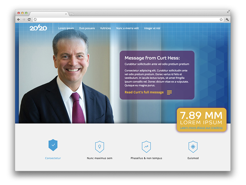
The first section features a hero banner that displays an image of the executive of the month, who was providing that message. There would be a long letter from this executive, which displayed a snippet in a box, and could be clicked through to open the entire message. A ticker slides in on the right, in a bright yellow box, displaying the total amount of consumer accounts.
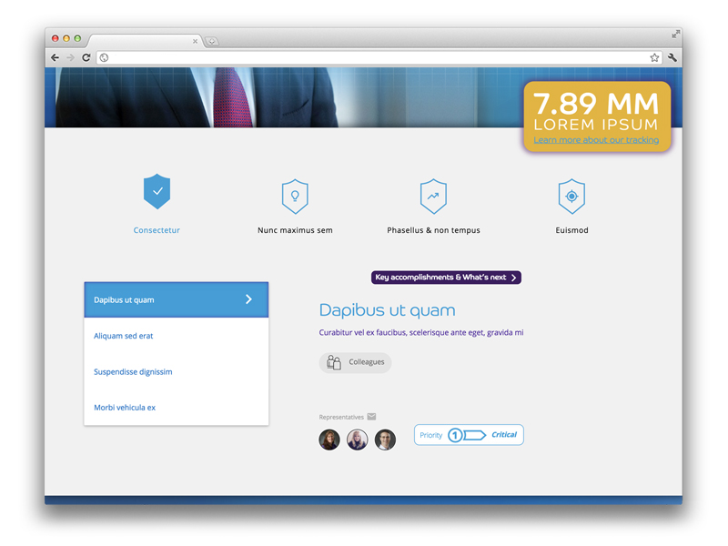
The second section lists the top level buckets, of which all the goals were distilled. Upon clicking one of these, a menu is shown, with a further breakdown of the initiative. For each menu item, a slider is used to rotate through information pertaining to that objective. A breadcrumb navigational element is shown to provide the user with a tool-tip for what to expect next. Tags and icons were created to display what category the initiative belongs to. The representatives for each objective are displayed with avatar headshots, and a clickable email link. Finally, priority levels were assigned to each initiative, with corresponding icons and graphics.
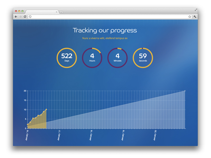
The third section features eye-catching graphics of a countdown timer, and graph showing number of consumer accounts per month, displayed against the target trajectory of the next five years.
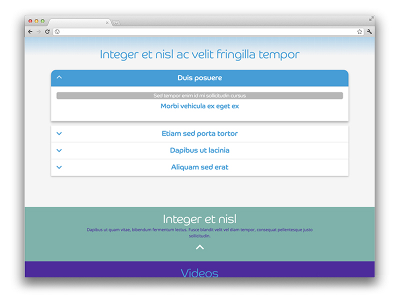
The fourth and final section features an accordion, that displays further information about these initiatives, nested into a clear hierarchy. Much of this information — when first provided to our design team — was impossible to understand, as it was all visible at once. But, when applying a hierarchy and different graphic treatments to typography, it became much easier to digest and understand. While I get it is difficult to see the exact nature of the communication — due to the Lorem Ipsum — I think the overall concept can be understood.