Pearce & Moretto Rebranding
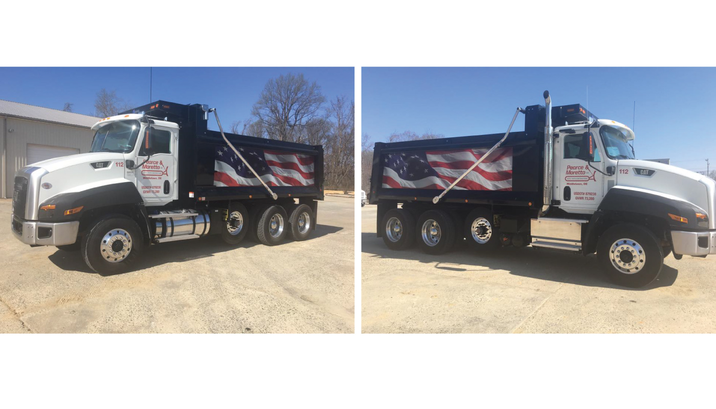
Pearce & Moretto is a civil engineering company located in Middletown, Delaware. They hired me to revise their logo without changing what it actually was. While open to ideas for ways of modernizing the mark, they wanted to keep the typographic bulldozer they had been using for years. This original logo was well established in their industry, and was used on signage, vehicles, and marketing materials. The goal of the new logo was to be cleaner, more modern, and look a bit more aggressive to properly fit within their industry. While undergoing this rebranding effort, the client was only interested in changing one thing at a time and did not wanting sweeping changes across everything. Therefore, this new logo needed to work alongside their existing logo – as that would still be used on their vehicles. The vehicle graphics used a different color red, from the original style guide logo, which had been defined by the color vinyl that they had previously chosen. It was decided prior to my involvement, that this was the color they wanted to be used consistently across everything.
Goals:
– Modernize the existing logo, making it look more aggressive, and cleaner.
– Existing concept of a typographic bulldozer must be maintained.
– New logo must be able to be used alongside the old logo, during a lengthy transition between logos.
– Vinyl color red from the vehicle graphics to be used as the consistent color for the identity.
– Create multiple size logos to be used on business cards to large signage.
– Create a style guide with vehicle signage guides for future vehicles.
The process for this project started by redrawing the old logo from scratch in Adobe Illustrator, since the client did not have a vector logo file. The tread shape shape that houses the tagline was refined to a perfect pill shape, and the tread marks were distributed evenly. The shape of the scoop was drawn to match up with the tread, and the lines were emboldened to add weight. The most dramatic change was the typography, and because this mark is a mostly typographic solution, it was the most important part. We mocked up dozens of fonts, and eventually settled on an italic square font that is very masculine and fits within the construction industry. I set the typography tightly, and combined the t’s. I set the top line on the angle of the italic, so that the alignment of the two lines form a forward moving dozer. Finally, contrasting the “Inc.” mark and tagline in all caps, and setting in grayscale gave the mark hierarchy and depth.
After successfully designing the new logomark, I needed to define the color to be used on all materials. Because we had the starting point of the vinyl red, I obtained a sample and worked backwards from vinyl to RGB, and CMYK. In addition, they required a tiny black logo to be used on ultra tiny materials. For this mini version, I stripped away the tagline and emboldened the tread to compensate for the visual weight. A styles guide was also designed, and contains a breakdown of all versions, files and additional rules for vehicle graphics.