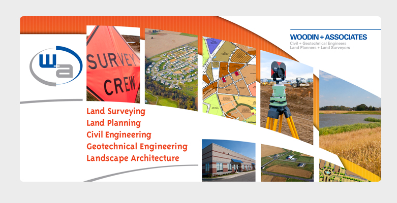
W+A Brand Identity and Website Client: Woodin + Associates
Woodin + Associates is a land developing and engineering firm in Middletown, Delaware whose main business is land surveying. In 2011, we revised their brand identity including their logo, signage, vehicle graphics, and redesigned their website.
Goals:
– Modernize the existing logo, making it look cleaner and more modern.
– Keep the general shape and aesthetic of the existing logo.
– Communicate the vernacular of the Construction industry, with the audience being industry professionals.
– New logo and colors must be able to be used alongside the existing logo and colors, during a transition between logos.
– Website contains various pages and projects sections.
The logo was redesigned from their original mark, which appeared dated and was geometrically uncomfortable. Using one of their tools of the trade: a land-surveying device, called a Philadelphia Rod Target Vernier device, I drew inspiration and developed several logo concepts that merged their existing logo with the aesthetic of the device. The “+” from their name was strategically placed to represent the crosshairs of this device. Because it was placed directly in the center of the oval, it creates a geometrically sound shape that is solid and stable. The old logo has the “+” to the right due to the sizes of the type, and makes it appear unstable and wonky. The new typography uses a very modern, futuristic looking face that has letters consistent in size. This allowed me to place the “+” in the center, which resulted in a balanced geometric logo.