Music Photographer Identity and Website Client: Rob McIver Photo
Perhaps my favorite project I have ever worked on was this one: for Rob McIver, a very creative photographer that specialized in music and band photography. Rob is a full-time photographer, and also a professional vocalist for The US Army choir. In addition, he became the band photographer for the US Army band. He also photographed lots of children, and personal photographs for couples; anniversaries, etc. His unique blend of talents and perspective, attribute to his style as an artist.
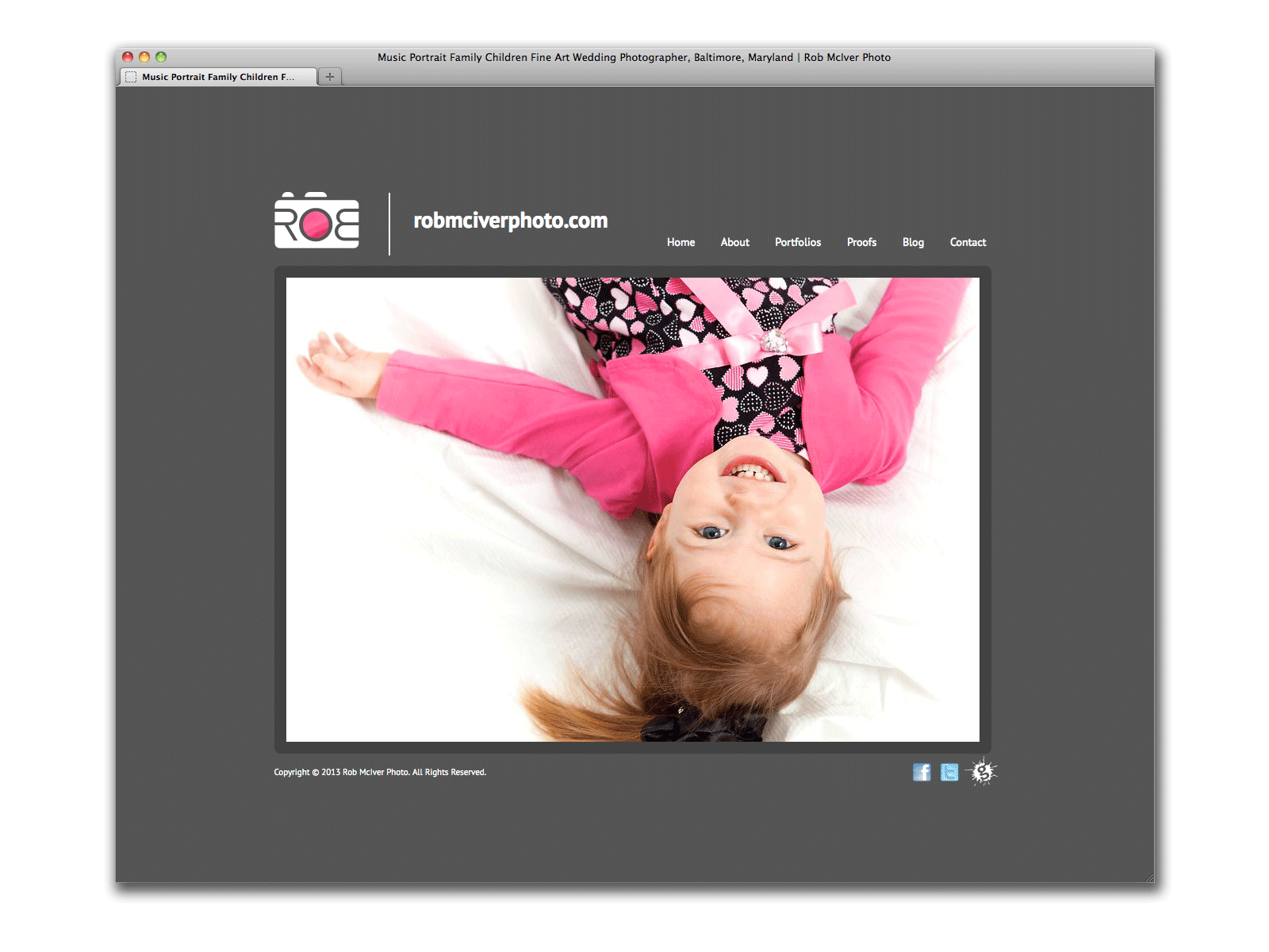
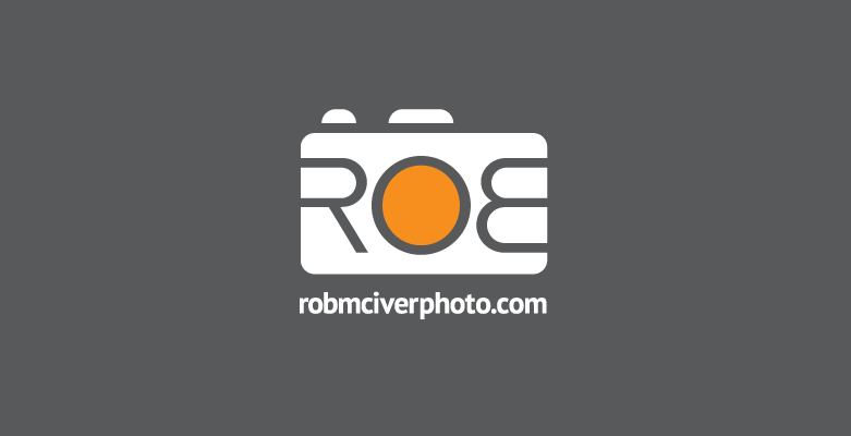
We designed his logo and identity at the same time of this website, and the most important goal was to be minimal, and let the photographs speak for themselves. I tried to speak his unique, often fun and silly, vernacular with a typographic play on his name: “ROB” across the front of a camera — the “R” and flipped “B” mimic the shape of human fingers gripped the camera from behind, and the “O” forms the shape of the camera lens. This play on type and human characteristics made it instantly communicable that: 1. he was a photographer, 2. he was fun, 3. his name was Rob.
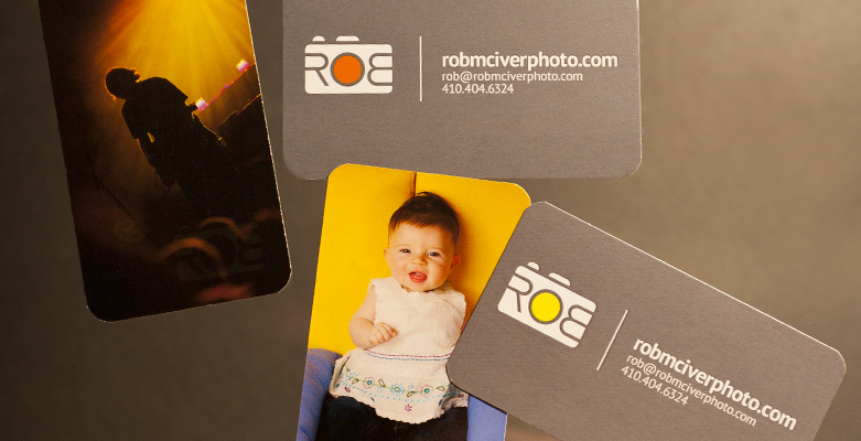
The logo was designed a gray color, or white against a dark background — but the “O,” which represents the camera lens, where the magic happens, is the center of the logomark, and also the center of his literal name. Because there were many levels of metaphor here, and we really wanted to push the boundary of uniqueness, I programmed the logo in Adobe Flash to display a focal point (and color) of whatever photograph the logo was accompanied by. If the photo had a pink detail, then that pink detail was shown in the center of the logo. If the photo was orange, the logo was orange. This was a very fun way to visually represent: the magic from the photograph, displayed through the camera lens, displayed through the logo, displayed through Rob’s name. Our initial goal of letting the photographs speak for themselves was also maintained with this convention because there was never more than one competing photograph. The photo seen through the logo was a highlight of that photo, and therefore it highlighted it, and did not compete.
Of course, this was only able to be represented in certain circumstances, where Adobe Flash could be used. And, as of this writing in 2021, Flash is no longer available. So, the rules for the logo color still apply, and are mainly used in print media. When displayed in static web form, a standard color was chosen: pink or orange.
In addition to the brand identity, we built a custom Flash website using SlideShowPro — a back-end slideshow software that was a management system for slideshows. The main site was Flash based, and for his blog I designed and developed an accompanying HTML WordPress website that matched the style of the main site. This job also included various business cards with several photographs on the back, and matching logo on the front.