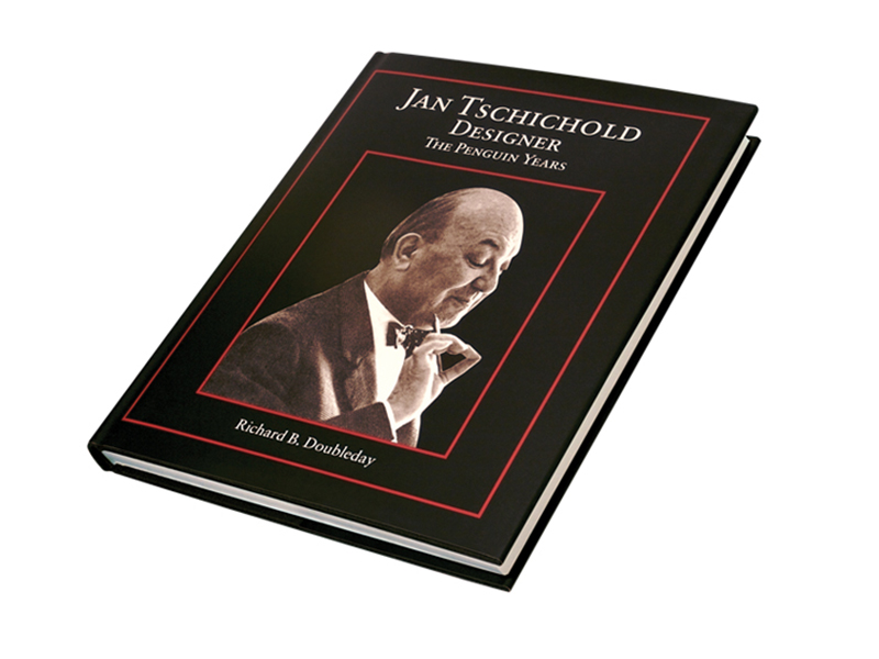
Jan Tschichold Book Design Employer: Oak Knoll Books
During my time at Oak Knoll Books, I had the opportunity to work on many fine-press, artistic books, but none were more rewarding than the complete book design and typesetting for Jan Tschichold, Designer, The Penguin Years. This project was offered to me by the author, as a freelance project outside of my daily role at Oak Knoll.
This project was a daunting task, because Tschichold was a master typographer and laid the groundwork for typographic conventions. He was very interesting because his early years, he was an advocate for centered, serif typography. But, in later years, he changed and laid the groundwork for Swiss design conventions: namely left aligned type and sans-serif typography. He had made a complete 180 in his design style, and that which he advocated.
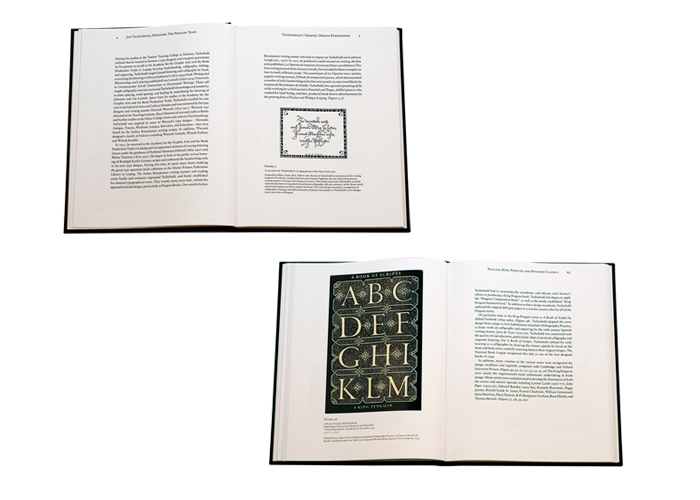
Because I would be typesetting an entire book for this master, I knew I had to pay tribute to his conventions. Due to the content of this book being his years at Penguin books, when he was in his early years, I decided to defer to his style from this period. The typeface I chose, Sabon — an elegant serif — was designed by Tschichold. Most of the formatting and typographical conventions used in this work are those recommended by this master.
The book is over 200 pages of dense type, elegantly set with generous margins, with a more considerable margin on the bottom, and outside. And margins of lesser weight for the top, and gutter. This allows for optimal visual balance. There are over 100 full-color graphics of Tschicholds’ book covers, with proper captions, and footnotes. The book type uses a hierarchy of type, utilizing small-cap titles, italics, and rules. The dense type was set with fairly tight kerning, and fairly open leading — with greater leading between paragraphs and sections. The entire text is fully justified, with careful attention paid to widows, hyphens, and gaps/rivers through the page. The pages were set to achieve an optimal, consistent texture across the page.
The typesetting of this book was capped off with an elegant title page, and book jacket design. The elegant design was a success, and had been the most in-depth typography project I have ever undertaken. While designing this book, I had become an eternal student of typography, and used this opportunity to hone my craft. It was a lengthy project with a massive Adobe InDesign file — and meaningful to the very end.